Turn to the letters page of any self-respecting philatelic monthly magazine and you will invariably find a diatribe from a reader bemoaning the paucity of creativity in current-day stamp design.
Whether it be yet another Harry Potter or Marvel series of stickers, or the ubiquitous photoshopped images that tend to monopolise stamp design, there is no shortage of criticism from collectors towards the world’s stamp issuing authorities.
Twas ever thus.
The earliest stamp designs were focused around a handful of conservative themes deemed acceptable for what was essentially considered a governmental receipt label: royalty or presidents, heraldry, numerals and allegory.
But when designers were let loose on so-called ‘pictorials’ and (heaven forbid) commemorative stamps, well…the armchair critics and self-appointed arbiters of design took no time in displaying their collective disapproval at such heresy.
Take the perennially popular pictorials issued by North Borneo in the 1890’s. Back in 1943, the revered Robson Lowe proclaimed…
“…almost every aesthetic fault is to be found in these vulgar and multitudinous little advertisements”.

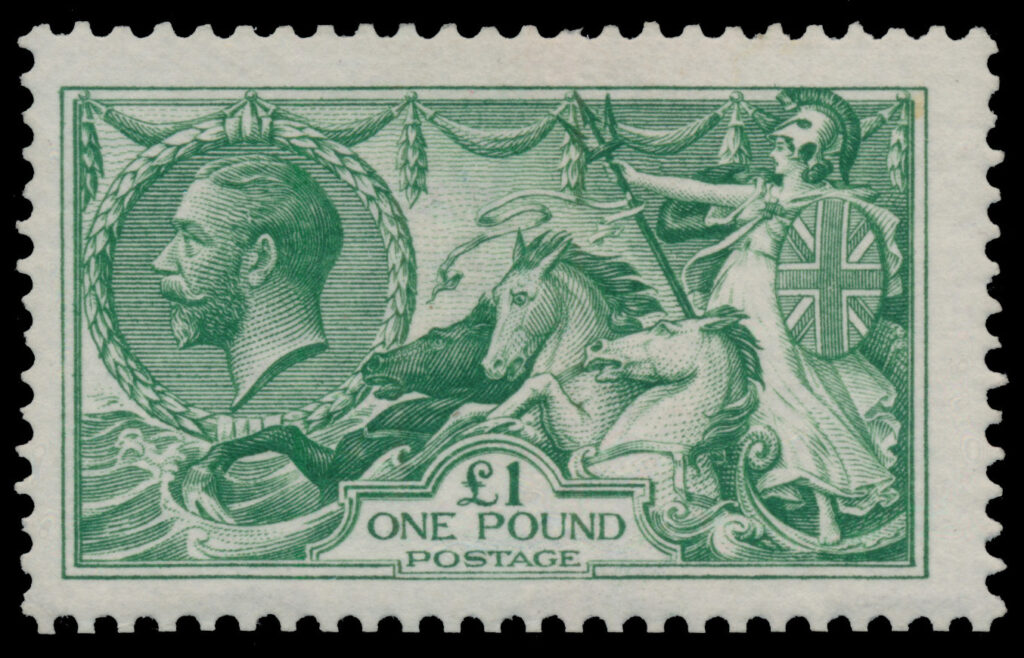
How about the classic Great Britain seahorse issue of 1913, often cited as one the world’s most beautiful stamps? Well, Robson didn’t think so…
He wrote:
“…one questions the motives of the ornamental decoration at the top, Britannia rampant and the three horses struggling against the horrid fate of being drowned in a sea of treacle”.
Mr. Lowe also didn’t think much of the American Bank Note Company whose designs, of course, are numerous amongst Latin American nations.
Again, in 1943 he wrote:
“The style of ABNC is characteristic, monotonous and tasteless: ugly frames are one of its consistent and principal faults. Once seen, unfortunately never forgotten.”
Ouch.
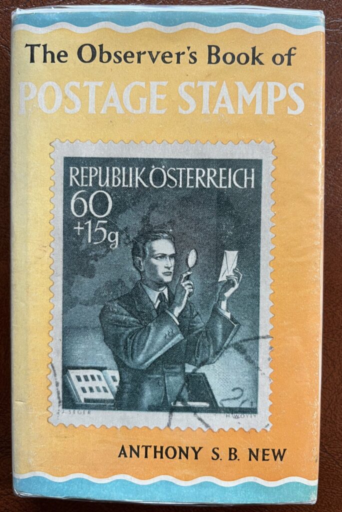
But my favourite design critic is Anthony New. In 1937 a series of small, pocket sized books commenced publication as The Observer series.
There was the Observer’s Book of Birds, Fungi, Weather, Aircraft, Dogs, Flags….a multitude of diverse subjects were covered.
The forty-second title in the series, published in 1967, was The Observer’s Book of Postage Stamps. And Anthony New was its author.
Now this wasn’t a book about collecting. It was about design. Mr New offered up his personal opinions on each of the world’s stamp issuing countries. And he didn’t hold back.
Latin American issues were comprehensively slated with just a handful of exceptions. To be fair, his criticisms extended to most corners of the globe. Clearly he was a hard man to please.
I thought it would be interesting to pull out a few of his acid-tongue quotes pertaining to various Central and South American countries to see how they’ve weathered over the past 55 years or so.
What do you think?
Central America
“Local productions from all six republics are mostly cheap imitations of bank-note styles…”
South America
“In stamp art (the) emphasis is still on borrowed ideas…”
Argentina
“Their dull little portraits lasted until 1936…”
Bolivia & Venezuela
“The typical local productions of Bolivia and Venezuela are poorly lettered lithographs, scarcely more than amateurish.”
Brazil
“…Brazil’s stamps during two decades were unsurpassed for sheer ugliness.”
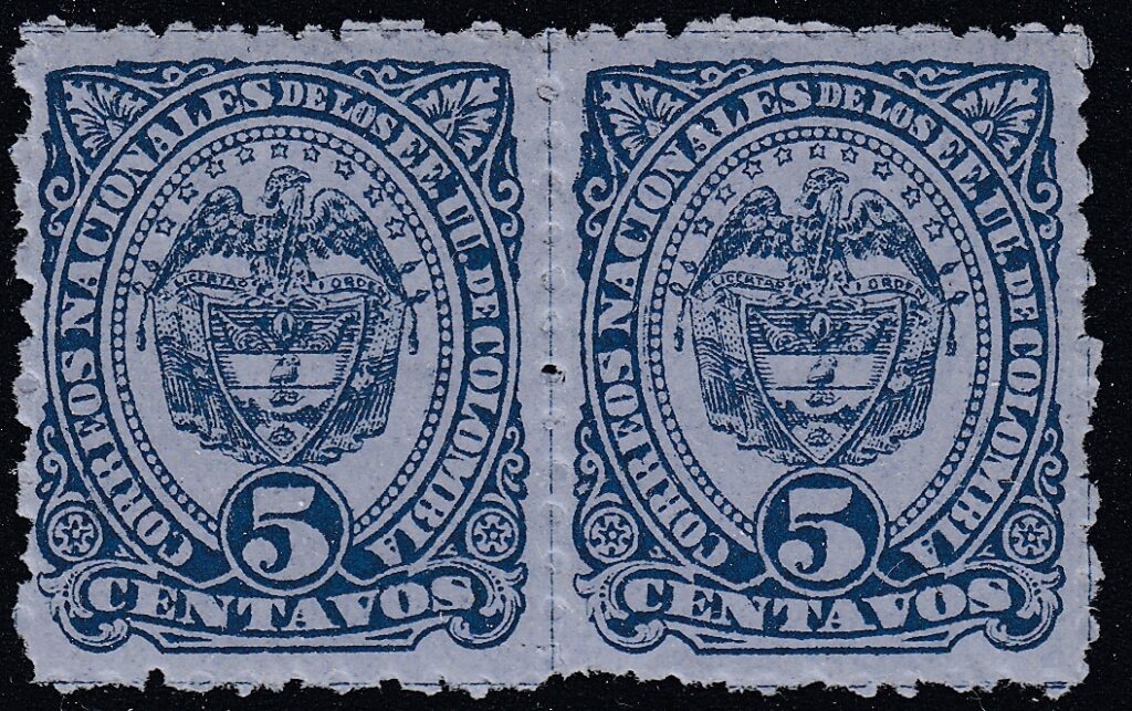
Colombia
“…their sameness is remarkable, versions of the national arms and a few portraits being multiplied ad nauseum inside poorly lettered circular or oval bands.”
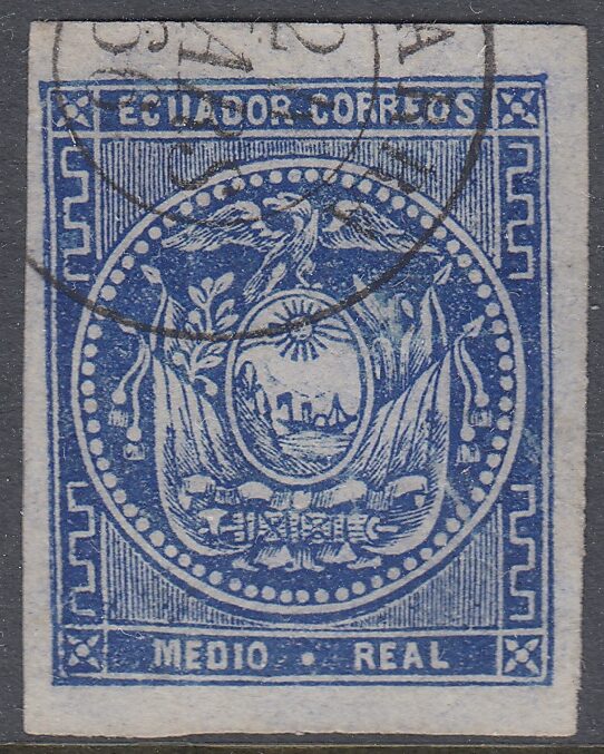
Ecuador
“The first Ecuador designs were amateurish adaptations…”
El Salvador
“Salvador’s Graphic Arts School evolved a distinct manner in the 1930’s and 1940’s…but hopes of further development of their ideas were unfulfilled”
Guatemala
“…lifeless portraits betray her engraver’s inexperience.”
Paraguay
“…has perhaps failed most dismally of all to escape from the influences of the bank-note and other foreign printers.”
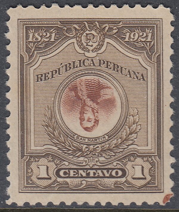
Peru
“…her first-class historical portraits of 1896 gave way to a motley collection of pictorials and then to a series of incredibly tiny heads with no pretence to beauty or dignity”
Uruguay
“…oscillated continually between the dignity of first-class engraving and the comparative cheapness of local imitations.”
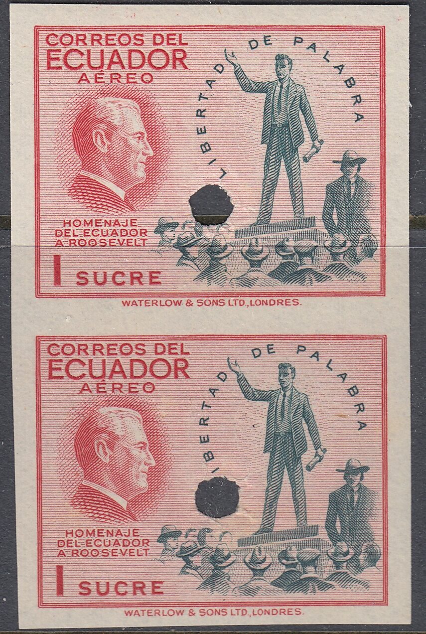
But my favourite take-down of any stamp issue has to be New’s comments on Ecuador’s Four Freedoms issue of 1948…
“These spineless designs are little more than assemblies of lettering and bits of engraving on anaemic toned rectangles…”.
Taking no prisoners with that one!
Gotta love him. Of course these quotes are taken somewhat out of context – you’ll need to find yourself a copy for the full story – but you get a good feel for his style.
But let’s end on a high note. Occaisonally a whiff of faint praise is deduced, no more so than for the Dominican Republic 5 centavos from 1936, described as being…
“One of the most magnificent of all stamp portraits…”.
Praise indeed.


So who died and declared either Robson Lowe or Anthony New the god-like authority on design? One forgets, apparently, in accepting their opinions (or diatribes) the role/influence of national administrations in deciding what was acceptable to them and their constituencies. Also neglected is the technical capabilities of engravers and printers, other than the largest BANKNOTE companies, to execute whatever designs were acceptable.
As a collector of Mexico, I certainly know that some of the classics are terrible designs, but I believe that as collectors we can only appreciate the design for the philatelic history its story tell us. When it comes to design, there is always room for faulting the design because this is a subjective opinions. I love the designs of Mexico’s Universadad issue of the 1930 for the artistic beauty, bit all those poor designs of the early classic are stamps that had the district overprint that gave the postal value and the beautiful cancels that enriched the stamps. So, if design makes so much of a difference then every other stamp’s history can certainly out weight a pretty stamps integrity.
Just my opinion, Bubba
In my view, the 5 centavos green first issue of Bolivia stands out as a truly beautiful, if naive, example of stamp design. It is instantly recognisable and moreover with 360 different versions, various shades and papers and nice wide margins lends itself to comparatively cheap study. Amongst locally produced Latin American stamps only the classical Brazilian numerals can rival this lovely stamp. The other values are nothing like as attractive.